Interact Therapy
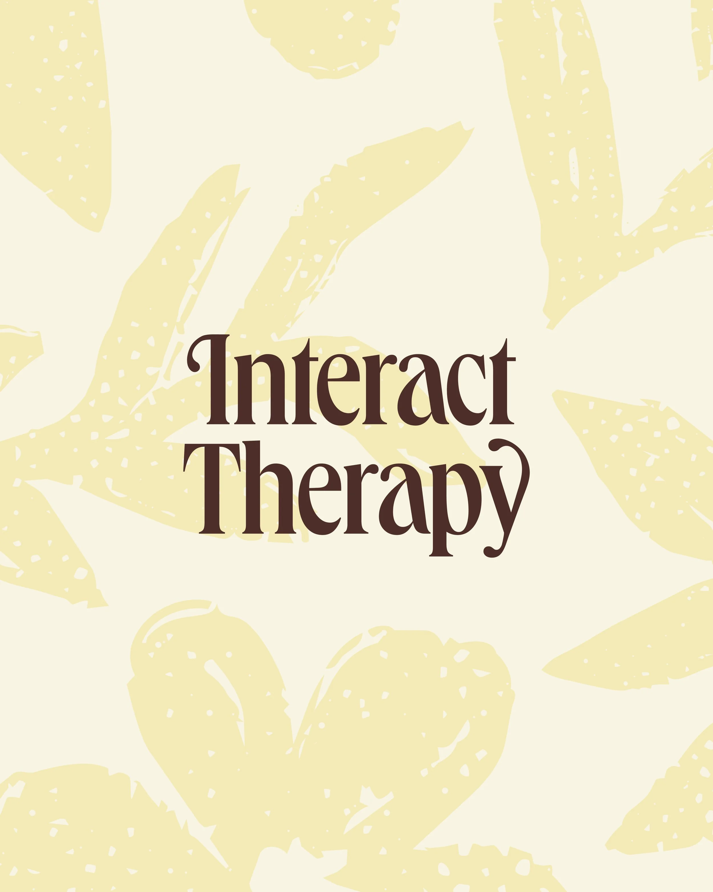
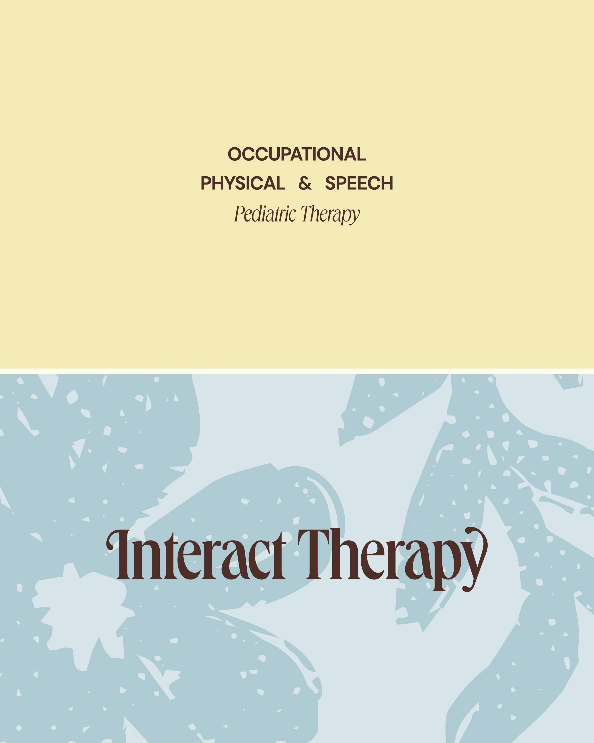
Meet the new Interact Therapy. When Interact Therapy came to LAB, they wanted a brand that felt like the people behind it: warm, present, and rooted in connection. In a sea of clinical, cold, and one-size-fits-all clinics, Interact Therapy is decidedly different.
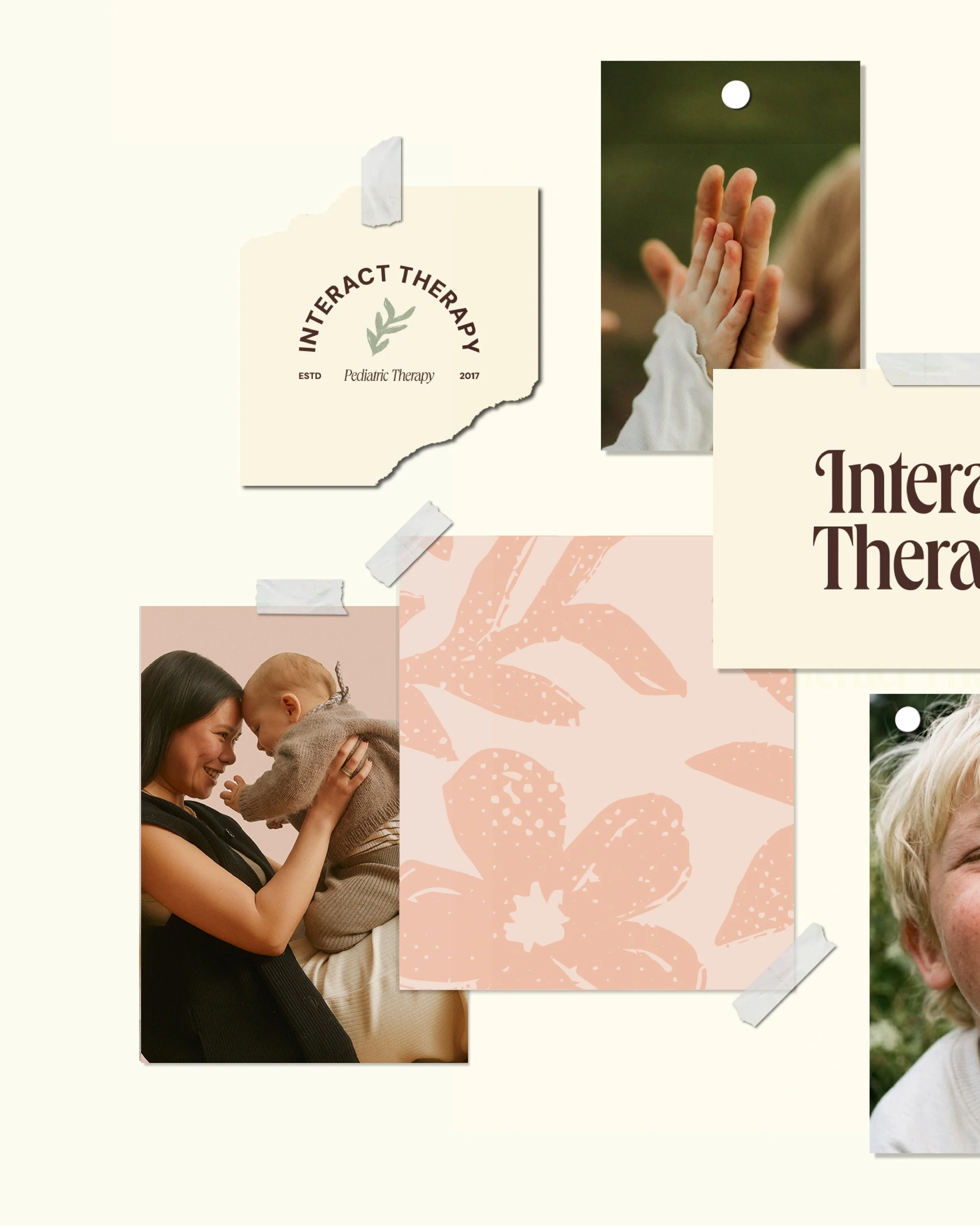
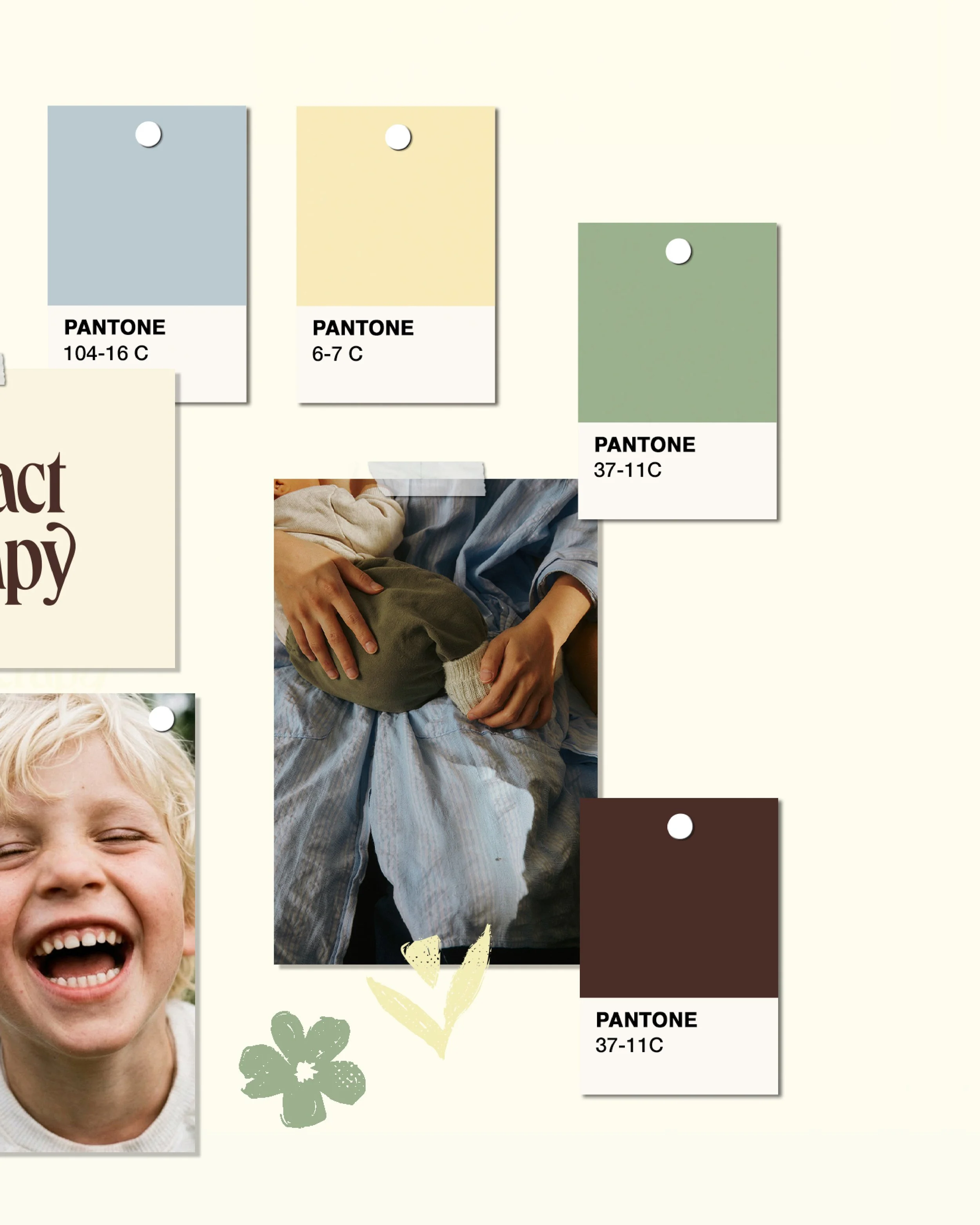
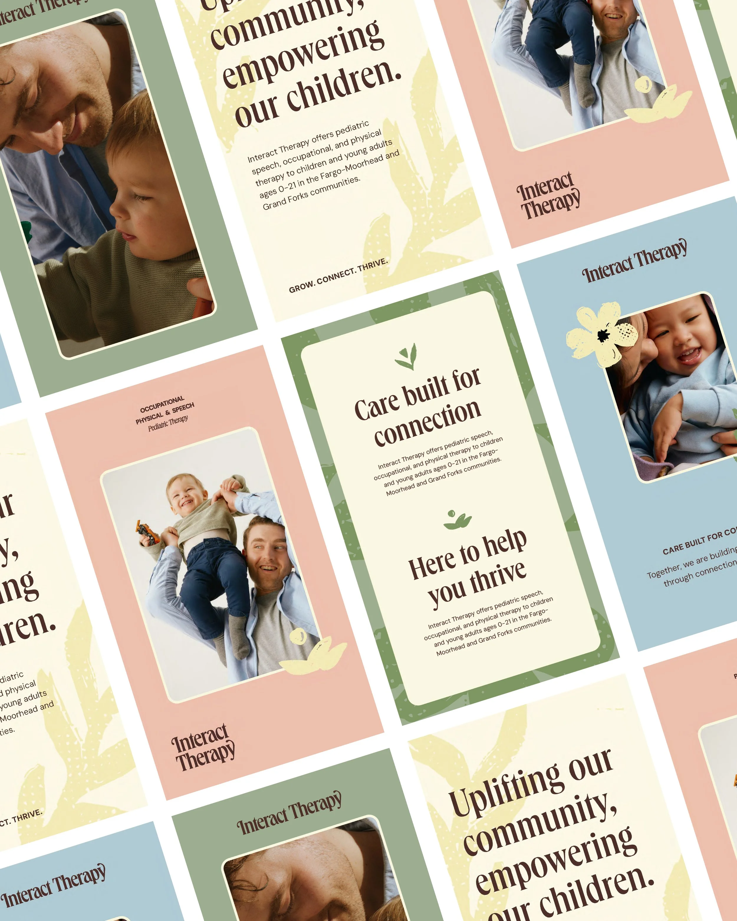
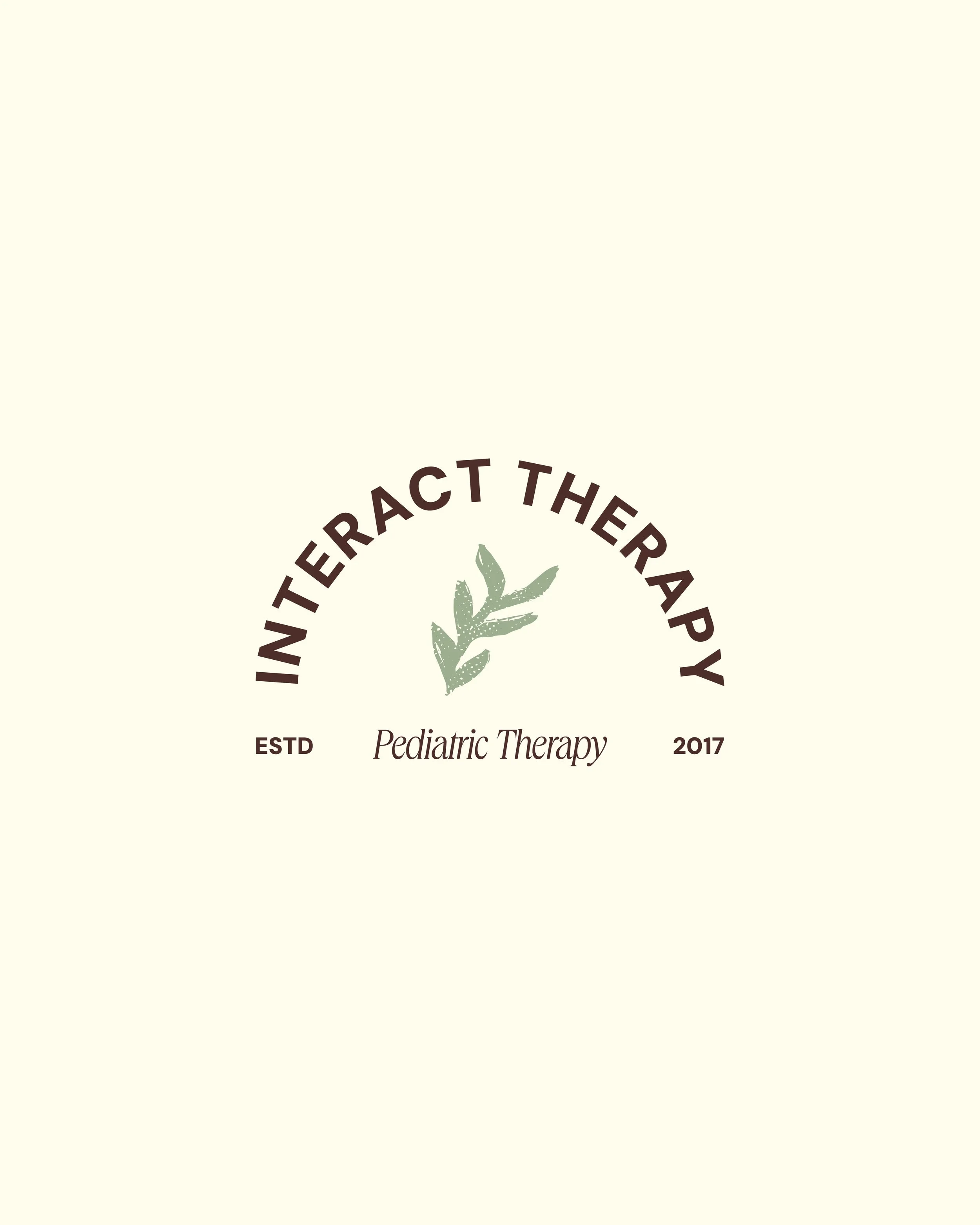
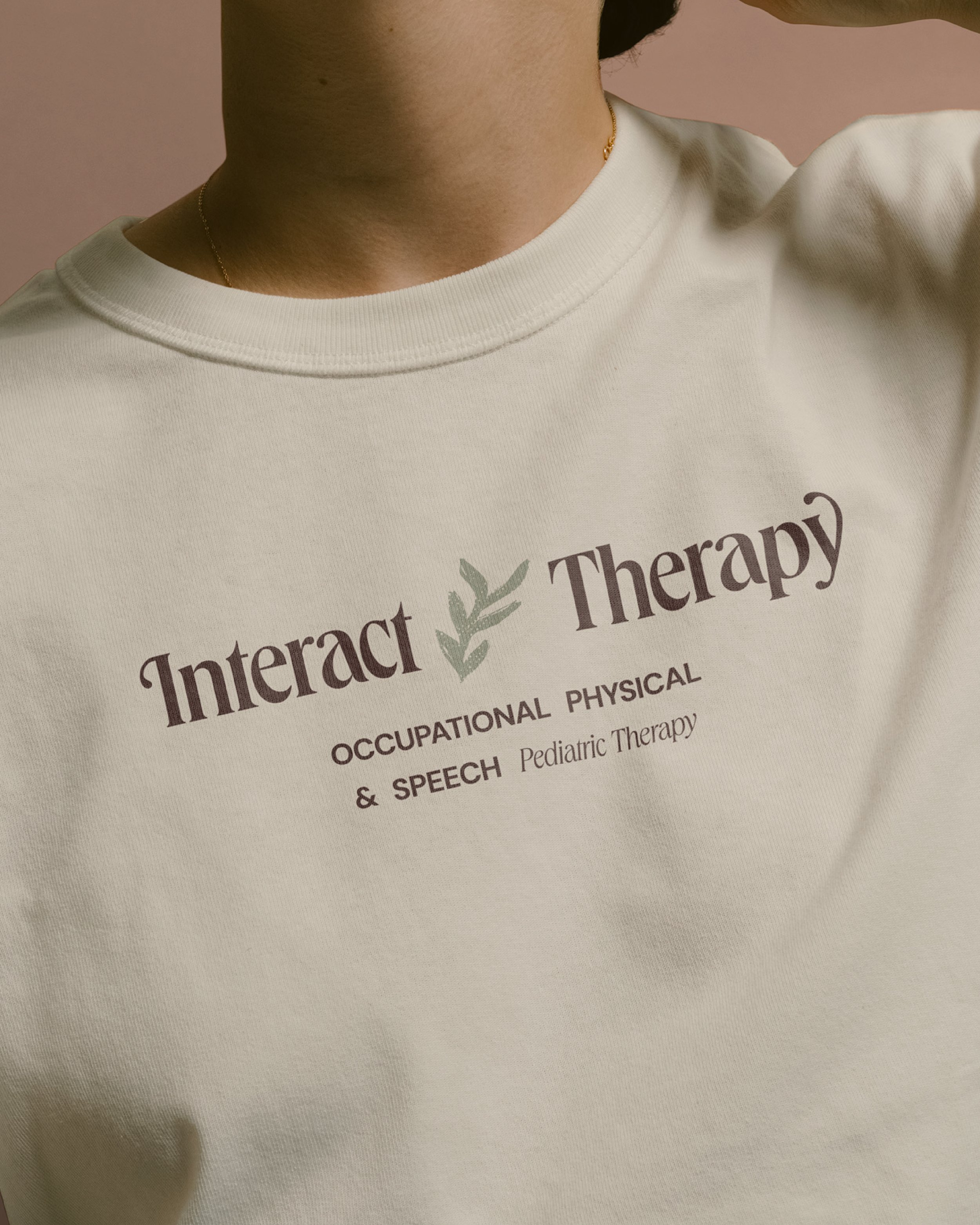
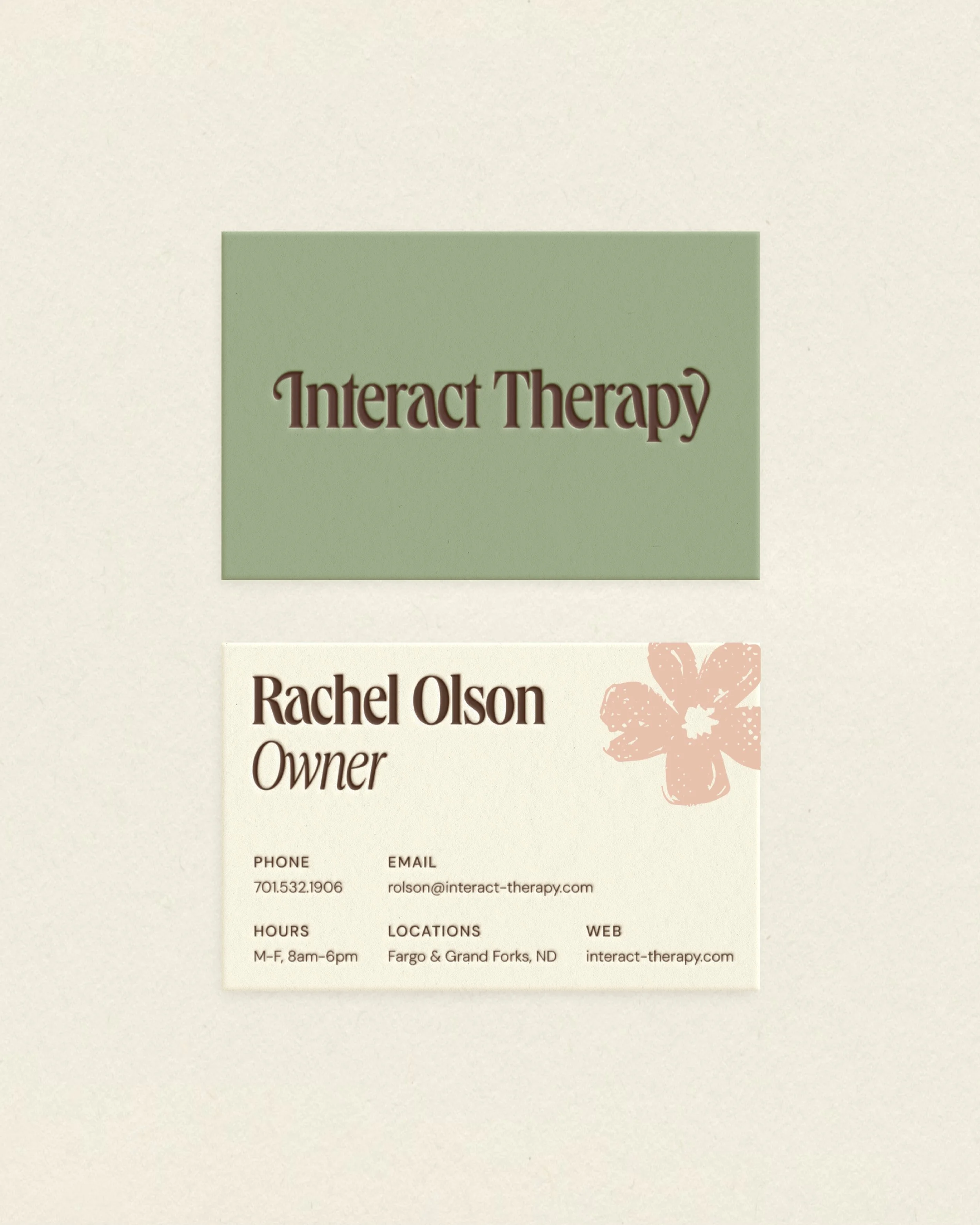
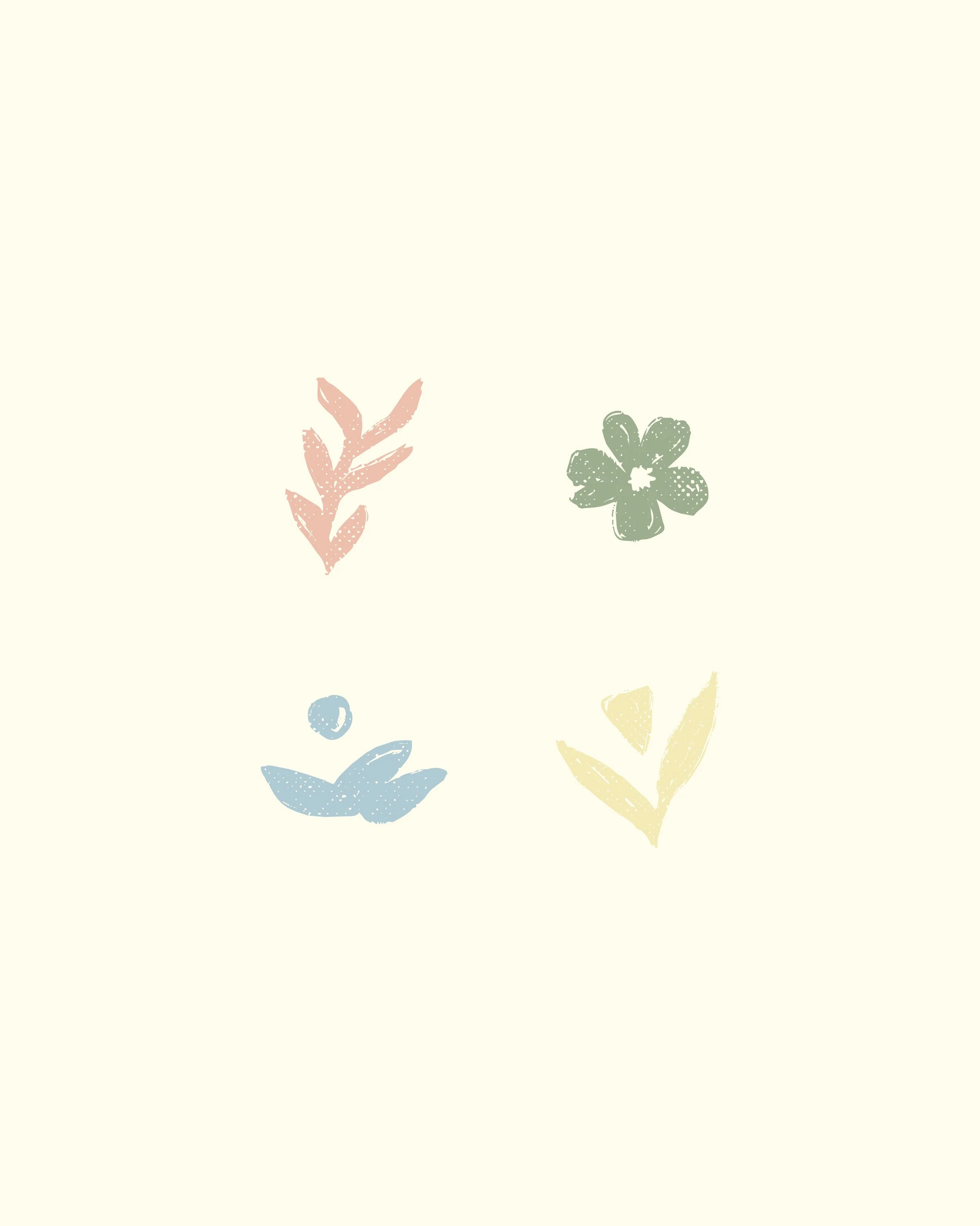
The result is a brand with a soft, earthy palette and organic illustrations that carry forward the floral elements from their original mark, reimagined for their next chapter. Every element was chosen to create a brand that is soft, welcoming, and inspired by the children they work with each day. The pastel color palette trades the sterile blues and whites common in healthcare branding for something warmer and more welcoming, paired with a mix of custom serif and sans-serif fonts that intentionally balance playfulness with a clean, professional edge.
From there, LAB built out a set of textured, organic illustrations to bring movement to the brand. Those same illustrations became the foundation for custom patterns that can live throughout Interact Therapy's office spaces, bringing the brand off the screen and into real life and setting the tone the minute families walk through the door.
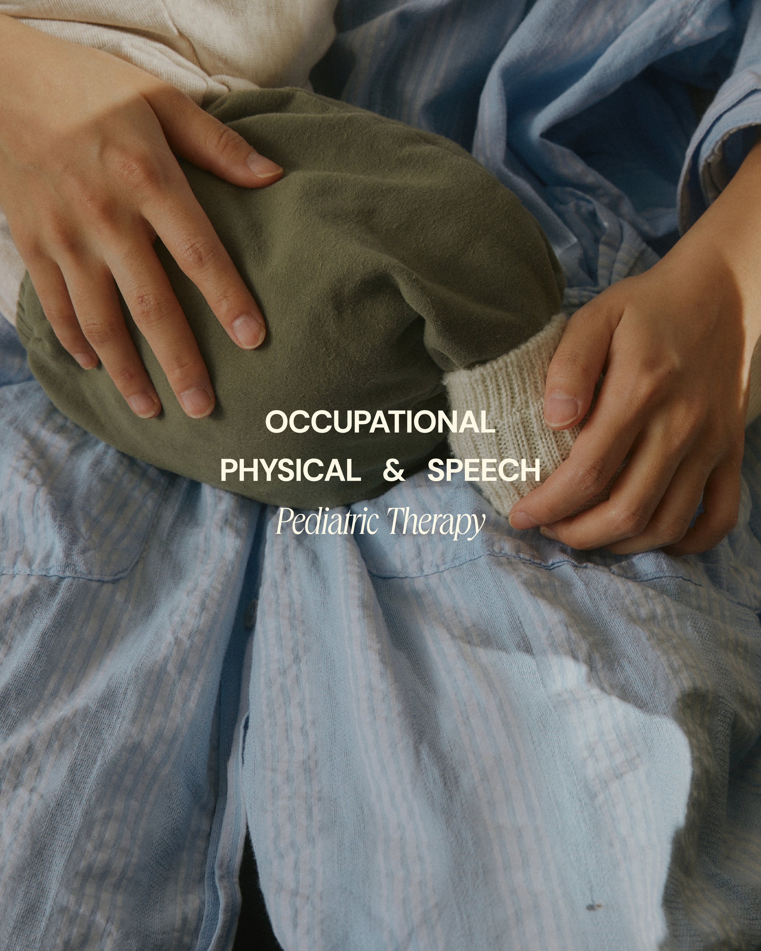
The brand voice confidently helps families navigate the world of occupational, physical, and speech therapy, introducing Interact Therapy not just as a resource, but as a partner in progress. The new brand copy delivers messaging with heart while articulating what makes them unique: clinical excellence, on-site care in trusted community spaces, and a commitment to progress that shows up in everyday life. At its core, a brand is about how it makes you feel, and for a practice built entirely on trust, that comes through in every word.
New look, same quality care.